(2 of 6 in a series)
Typography is the visuality of words. It can be friendly and informal or very serious and traditional. It can be flirtatious, flamboyant, fun or grungy, grotesque grim. In most cases with the clients I help, it is has to be modern, clear and most of all professional.
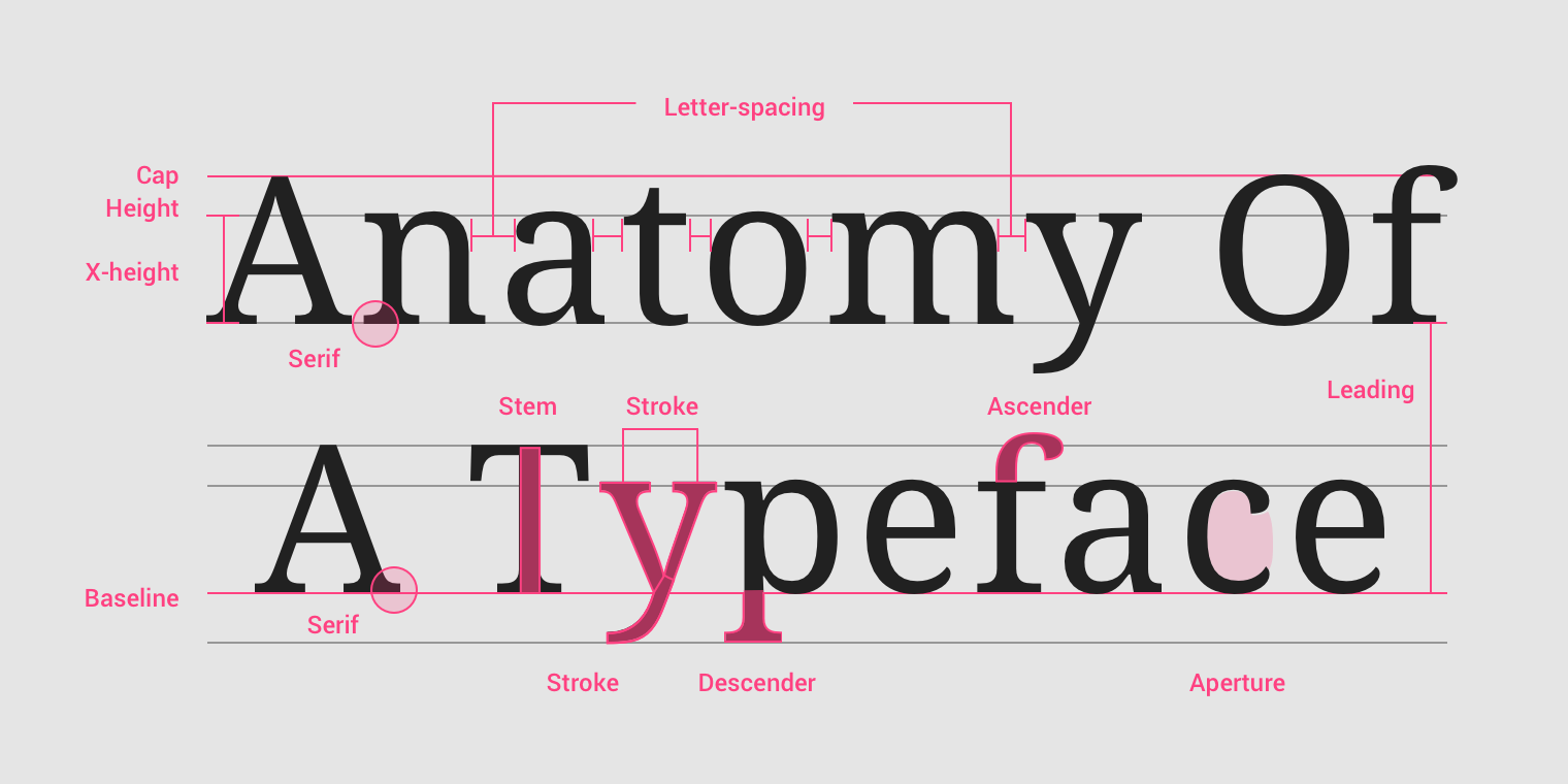
First of all, let’s discuss the categories of typography:
- Typography is the style and appearance of printed matter or the art of arranging type.
- Typeface that is defined as serif, sans serif, script, monospaced, and display
- Fonts are the individual styles within a typeface including weight, style, width, slant, italicization, and ornamentation.
To get more information about the basics of typography, check out Material Design Website.

Companies have a few choices when it comes to typography.
- Proprietary – A design agency can be hired and ensures a unique brand unlike any other.
- Foundry – Purchased through a type foundry with many fonts to choose from.
- Open source – Free fonts that are easy to use across the enterprise can be found on several websites.
We take typography pretty seriously for every company we work for. There is no such thing as substituting and no excuse to use a typeface that is not part of the brand guidelines. It’s pretty easy to adhere to these rules, the challenge comes in when a designer has to decide which style of typeface to use in the layout of anything they create.
The following are the things I make sure to do while working with type:
- Proper typeface
- Proper scale
- Proper balance of type weight and style
- Proper color in relationship to the content
- Proper technical use
Hopefully, the guidelines will include direction for most of these styles of type, but many times, they are left up to the designers to determine. Creating standard styles for the content can save an extraordinary amount of time on the part of the designer and speed the delivery of a refined and consistent white paper, brochure or advertisement.

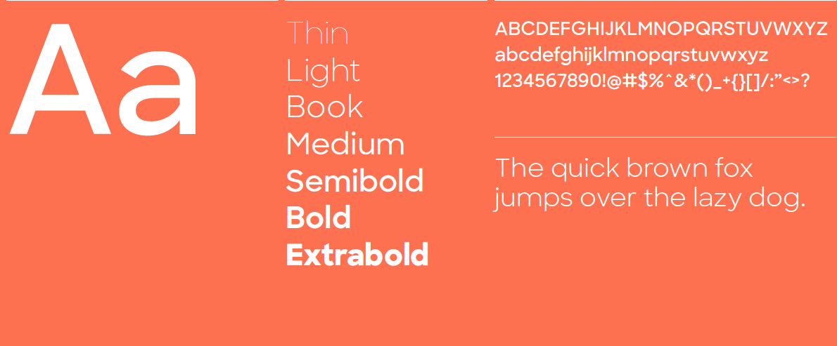
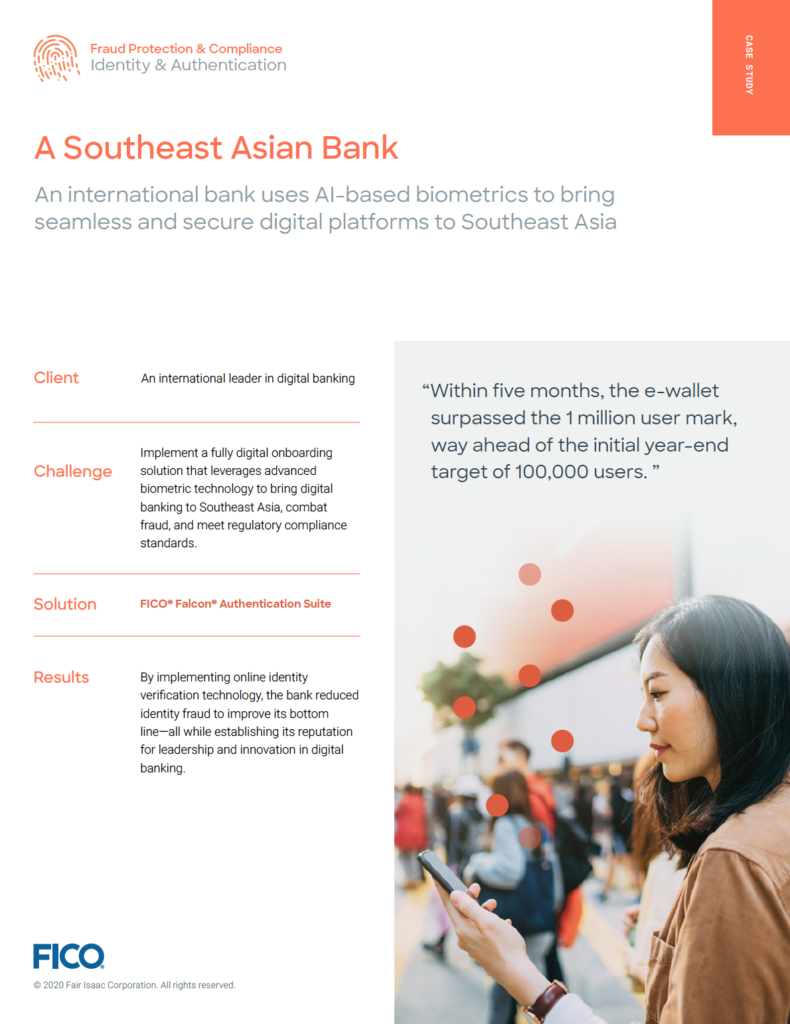
As an example, FICO recently added a display typeface to their brand guidelines. All their newly branded white papers, case studies and brochures are featuring Sharp Sans in addition to Roboto.
- “We will use 'Sharp Sans' for headlines, headers, quote styles
- and any instance where we want to evoke the personality of the brand.
- Its geometry and open letter forms mimic the FICO logo, as well as our graphic style.
- It feels clean, elegant, classic and still modern.”


Visit Our Work webpage to see more examples of FICO’s marketing materials that D&Co has designed and produced over the past year.