(6 of 6 in a series)
The “COVID” year went by fast yet felt so slow. Business stayed steady yet seemed sluggish. The contrast in reality to perception is almost unbelievable. Comparatively, design layouts can look unbalanced although it is perfectly symmetrical. It is all dependent on tying many elements together visually. This post will focus on three principles that are important to meet the challenge of creating a layout on brand.
Grid
The foundation for a balanced layout
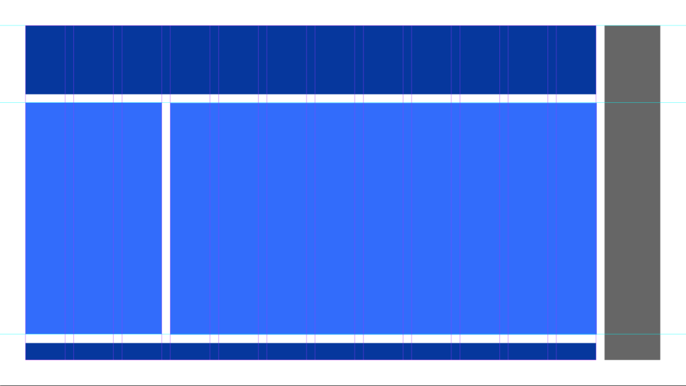
The Golden Rule is crucial to know when creating a layout. It becomes second nature to most designers. It creates a focal point, rhythm and proportion. Whether creating a multi-page document or a series of posters for an event, creating a flexible grid can accommodate multiple variations with a consistent look. Below is an example of an e-book template that is based on a 12 column grid that can be divided into 2 variable width columns or 3 to 4 even columns easily to accommodate any combination of copy, graphics, photos and illustrations throughout the document.

Hierarchy
Creating content that flows
Although all aspects of the layout are important for staying on brand, the hierarchy is the most crucial to signal the reader what to see first, second, third, etc…
Click the tabs below to see the elements a brand adheres to when creating the hierarchy of layout. Superior brand guidelines leave nothing to question in the execution of a layout.
Importance to larger objects.
Brand colors are useful to create levels of importance.
Fonts and colors create dramatic changes and catch the viewer’s eye.
Connects the elements and accentuates the focal point.
Grouping like items together.
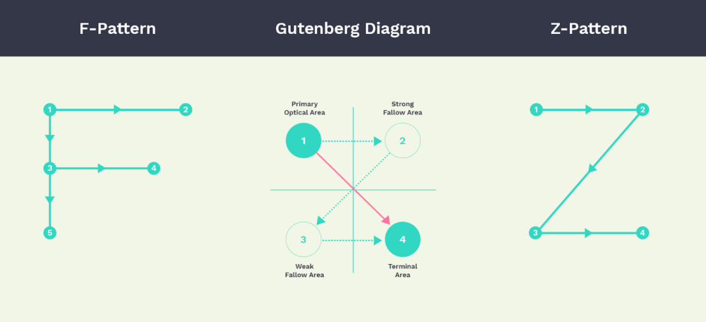
Gutenberg’s diagram, a viewer typically skims the page in a Z-pattern. See the diagram below.
- Scale
-
Importance to larger objects.
- Color
-
Brand colors are useful to create levels of importance.
- Contrast
-
Fonts and colors create dramatic changes and catch the viewer’s eye.
- Harmony
-
Connects the elements and accentuates the focal point.
- Proximity
-
Grouping like items together.
- Alignment
-
Gutenberg’s diagram, a viewer typically skims the page in a Z-pattern. See the diagram below.

Consistency
The thread that ties designs together across a brand
Colors, fonts, imagery, illustrations and logo use as well as the grid and hierarchy play a part in developing that consistency so people can easily recognize the brand wherever they see it.
We’ve been working with the Fraud Marketing Group at FICO where we’ve created everything from ebooks and white papers to fact sheets and presentations. The colors, fonts, imagery and graphic elements within the layouts achieve the feeling of belonging to a family.
It took a while to get this final blog post of the series published, but it is better late than never.
The Latin phrase ‘potiusque sero quam numquam’ which translates as “better late than never” was used in History of Rome, written around 27 BC by Titus Livius. Source: theidioms.com
Geoffrey Chaucer appears to have been the first person to have put the proverb into print, in The Canterbury Tales – The Yeoman’s Prologue and Tale, circa 1386:


