(5 of 6 in a series)
I touched on illustration in the previous post, but I think it deserves its own post when you examine some brands that utilize illustrations as their main visual system. I’ll show several examples of companies that practice this style, but first, I would like to touch on why a company would use illustrations instead of photos.
Here are a few high level reasons:
- Provide storytelling elements to very specific content.
- Create subtle emotions that can’t be found in stock photography.
- Communicate more complex concepts that can’t be shown in any other way.
- Allow you to build a world completely unique to the brand.
In addition, companies might prefer the idea of using vector images to keep their brand clean and modern especially if the company is seen mostly online. It also allows for elements to be combined in unlimited ways and creates consistent visuals that help customers identify their content without question.
Challenges include:
- Time to create the visual language.
- Management of the usage and extension of elements.
- Consistency across all concepts.
Oracle's superior example of using illustration
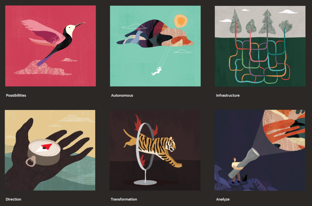
Oracle just rebranded last year with such a drastic change that it can not go unnoticed. They focused on making the Oracle brand warmer and more personable. I believe it’s a hit with making them stand out from the crowd.

Human, Sophisticated, Aspirational, and Intelligent.
Oracle’s homepage uses many of the data textures they developed. These textures “convey that data is in everything we do.”

Their carefully constructed conceptual illustrations are key to humanizing complex, technical subjects and information.
An article written by Business Insider captured their new brand if you would like to learn more.
Shopify's extensive brand guidelines are exemplary
It is reassuring to a designer when a company invests in true guidance of their visual language in a very specific way. Named Polaris for the guidance it provides, their extensive branding website shows how their illustrations create unifying elements throughout their experiences.

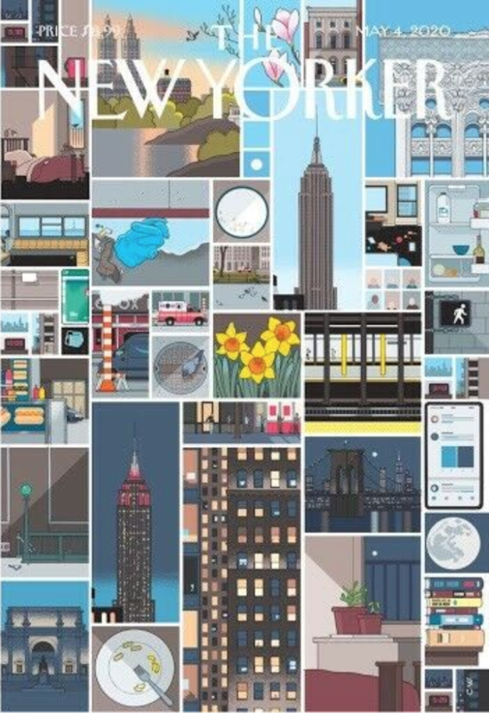
The New Yorker magazine is my all time favorite
I love everything about The New Yorker magazine, from every cover, to the political cartoons and every little illustration in between, the illustrations of The New Yorker are thought provoking, relevant and engaging. It may also have to do with the fact that I’m originally from NYC.
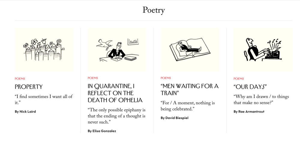

For more information on how they choose their illustrators for the cover, read this article from AIGA Eye on Design
One last note
From the Creative Bloq article “10 top illustration trends for 2020” Roly Grant, co-founder and creative director of Without says:
“When markets become saturated with familiar material, styles and voices, the best brands find a way to break out. Illustration for the best clients may therefore get a lot weirder in 2020.”
