(1 of 6 in a series)
In this first post of the D&Co Design Blog, number 1 in a series of 6, I want to discuss what we do on a daily basis for all of our clients – following brand guidelines.
Every company we do work for has brand guidelines which pose the biggest challenge to the design process. Depending on how comprehensive those guidelines are can make the job of designing more or less difficult. Some brands are more successful at their color use while others have a hyper definition of their imagery, including photo and illustration style.
I’m going to break it down to 6 main categories of design elements that are essential to differentiating and keeping each brand unique:
- Color
- Typography
- Logo
- Imagery
- Illustration
- Layout
You might be wondering, at this point, “What about the voice of the brand?” Well, the voice is important in every aspect and I will discuss how it affects everything in the design process. The people behind the voice – the copywriters, editors and proofreaders – all have a very important role in this process. It is a symbiotic relationship since what we do with design is highly dependent on the content.
Color
I have found that color is what people get the most passionate about when discussing design in general, not just a company brand. Color is the reason I became a graphic designer in the first place. Early on, I took a liberal arts class called “Color Theory” before I even considered becoming an Art Major. That sparked something in me and have been obsessed with it ever since.
Here’s an excellent resource on the use of color by Shutterstock posted in 2018 “Complete Guide to Color in Design: Color Meaning, Color Theory, and More”

Most, if not all, companies will have a Pantone color designated as their brand color. This color should evoke an emotion the company wants their products or services related to. Their logo is the first impression of this and must always be represented accurately.
For example:
D&Co: Pantone Rubine Red – We chose Rubine Red for D&Co to make sure clients feel comfortable working with us. Dark pinks have effects similar to red – heightened emotions, while pale pinks are more soothing. We want you to be emotionally attached to us while seeing us as a strong partner for your business.


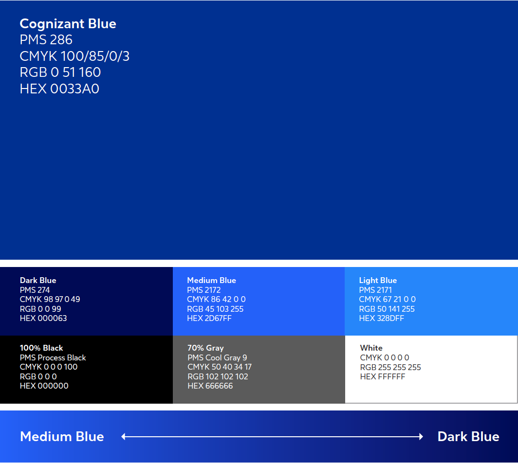
Cognizant: Pantone 286 – Blue is often associated with depth and stability. It symbolizes trust, loyalty, wisdom, confidence, intelligence. Their goal is to be seen as the ideal partner for their clients in this high-stakes technology market.
Blue and green have been associated to the Cognizant brand for many years. They updated these familiar colors to more vibrant, modern hues, sending the message that they are the same Cognizant clients know and trust, but with a more modern look that plays well in digital environments.
Cognizant is pushing the evolution of their brand even further and is currently eliminating the green and using a family of blues for a more laser focused brand color usage.


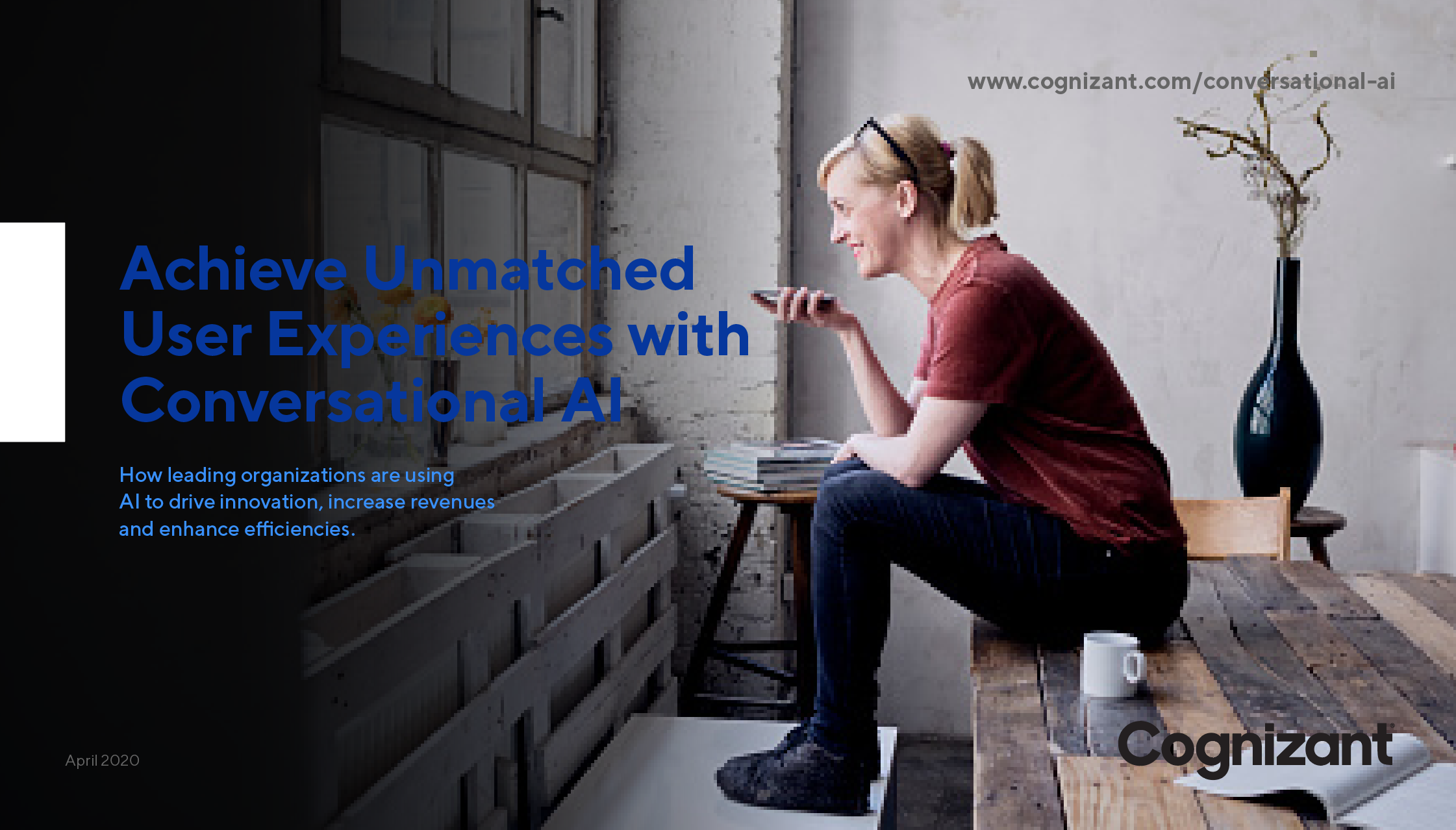
There are several factors in ensuring the correct usage of colors in the layout. In the example above, the main Cognizant Blue is dominant while the Light Blue is used more sparingly and with enough contrast. Even the image is using mostly gray and white which aligns with the color palette as well. I do wish her shirt was either black or blue for this particular instance, but I think it’s a subtle enough red that it doesn’t distract from the dominant colors.
The following are the factors I take into account when making sure I’m using color according to the brand:
- Proper colors
- Proper amount of each color
- Proper balance of colors across the page
- Proper contrast, tone and hue are used properly
- Proper brand voice and color relationship
If I were to alter the example to an improper usage, you would not recognize it as being a Cognizant piece. Even though I am using colors from their color palette, the example on the left doesn’t use the proper amount of each color, has bad color balance and has bad contrast making it hard to read. Finally, if the text is hard to read, the message doesn’t come across as a strong and confident voice of the company.
Incorrect color use

Good color use

D&Co is continuing to help with their brand evolution by reworking white papers, ebooks and infographics to align with their modernized brand colors. We welcome this challenge to help Cognizant continue their brand association with being a stable and trustworthy company.
Visit the Portfolio page to see more examples of Cognizant’s Thought Leadership material and come back often to see new pieces using the newly defined colors.