Working with a familiar brand
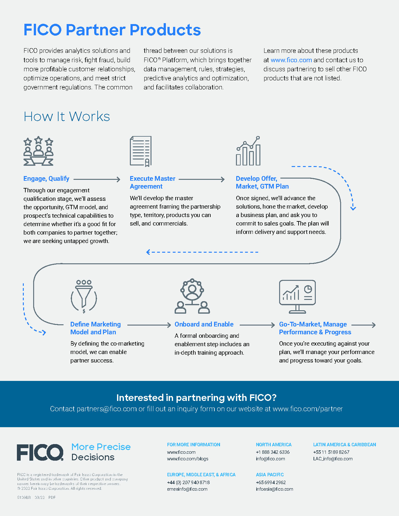
D&Co has worked with FICO for a long time — over 15 years — and we’ve seen many changes to FICO’s brand. But one thing has stayed consistent through the years, their pursuit of keeping the brand fresh. This particular piece was the last piece I created for the company in 2022. They have recently gone through another round of rebranding to keep relevant in marketplace.
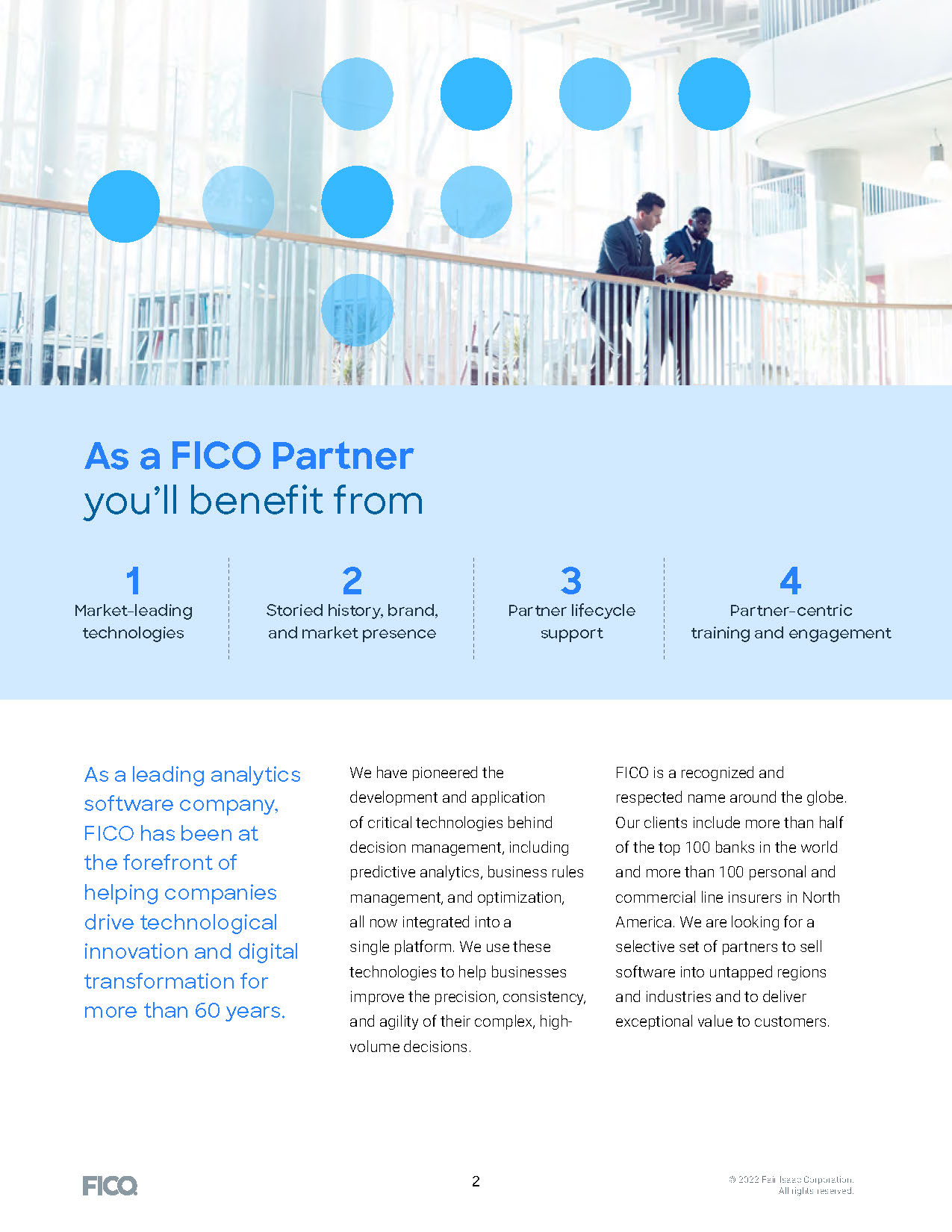
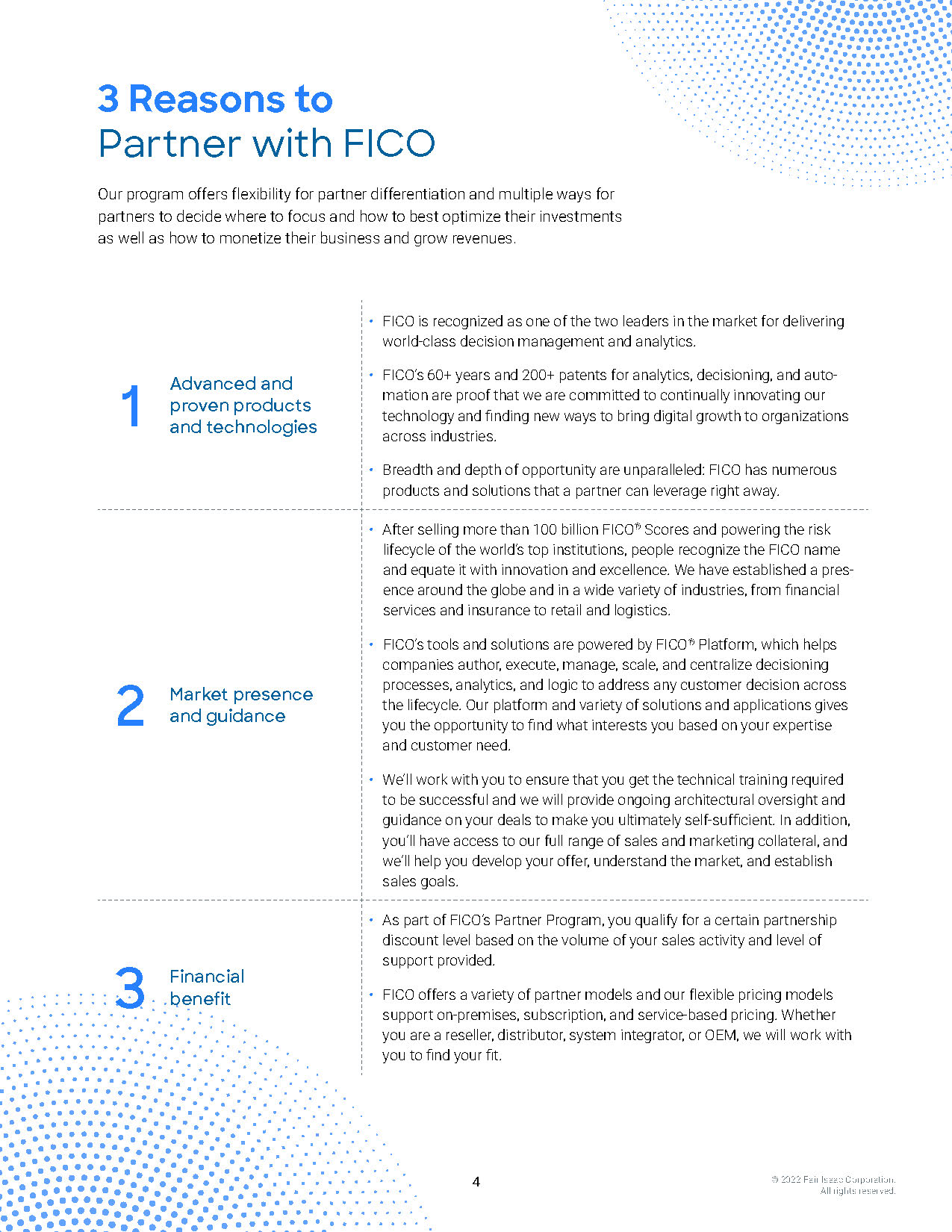
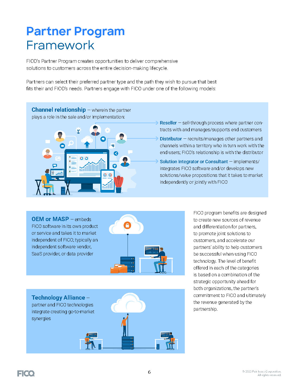
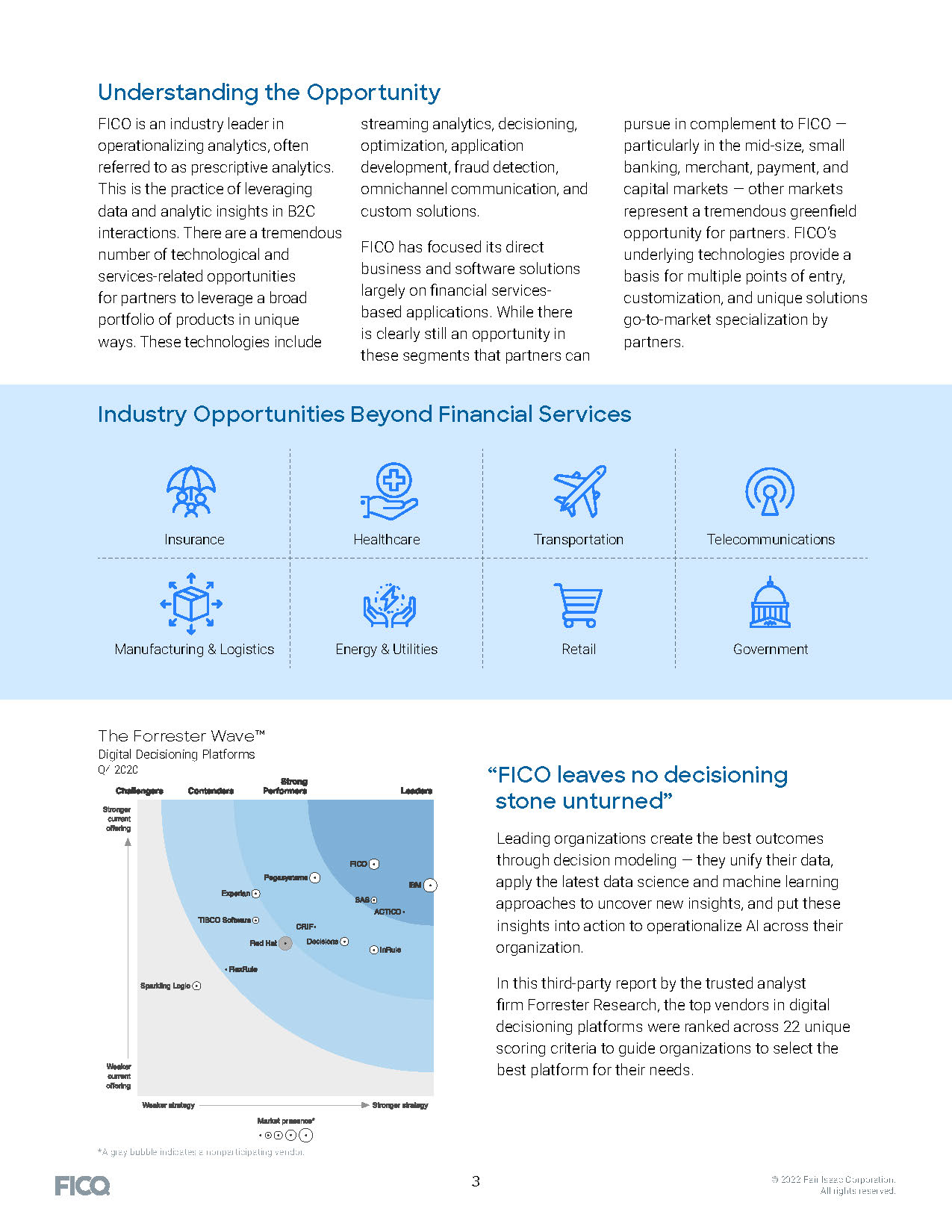
D&Co combined the FICO brand elements of dot patterns with their style of photography to include lots of white space. Even the full bleed page stays bright with the light blue background.
Download the full brochure here.

