(3 of 6 in a series)
A company’s logo is, by far, the most important part of the company branding and CANNOT be incorrectly represented.
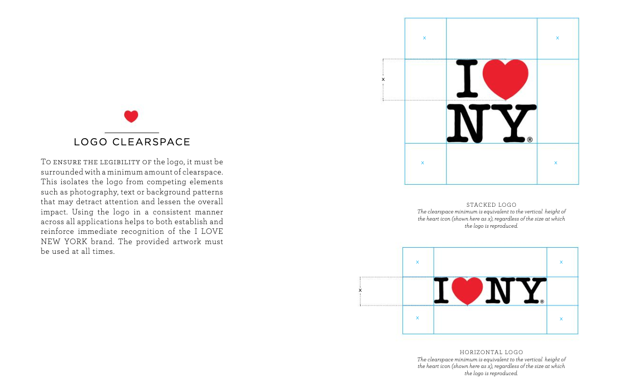
Since I am a big fan of Milton Glaser, the creator of the I ❤ NY logo, I want to share the comprehensive online guidelines. They are clear, concise and leave no question as to how to use the logo.

There are universal rules that dictate how most companies use their logo, like never altering its typeface, color or proportions. I’ll illustrate how a company defines each of the following attributes when using their logo:
- Color
- Scale
- Clear space
- Trademarking
- What to avoid
The color
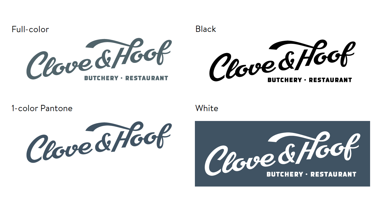
Company logos are usually limited to three variations – Primary corporate color, white and black. Clove & Hoof used a single color they pulled from the color inside the restaurant.
D&Co helped Clove & Hoof, a restaurant in Oakland, CA, establish the rules for logo usage as part of their brand guidelines. We ended up calling their primary color C&H Steel. In addition to their PANTONE designation, CMYK, RGB and HEX values were defined.

The Scale
You may be allowed to scale the logo for specific uses, but ensure that the logo is clear and legible in every instance. Establishing a minimum reproduction size is essential.

The Clearspace
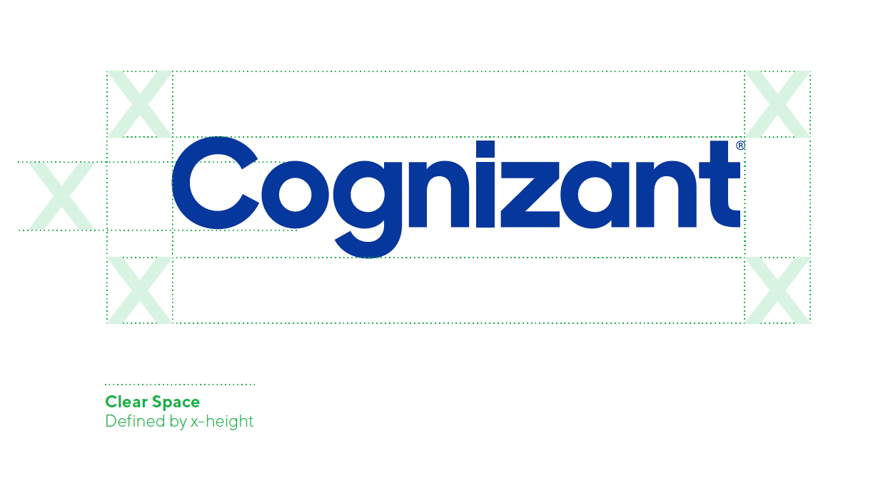
The clear space is the area around the logo that must remain untouched by typography or graphic elements. This guarantees that the logo is presented clearly, and with maximum impact. The clear space is defined by the unit “x,” which is equal to the x-height of the logo.

The Trademarking
Dictated by the company’s legal division, there are very specific rules on how to use the registered trademarks, so keeping compliant is a high priority in the branding process.
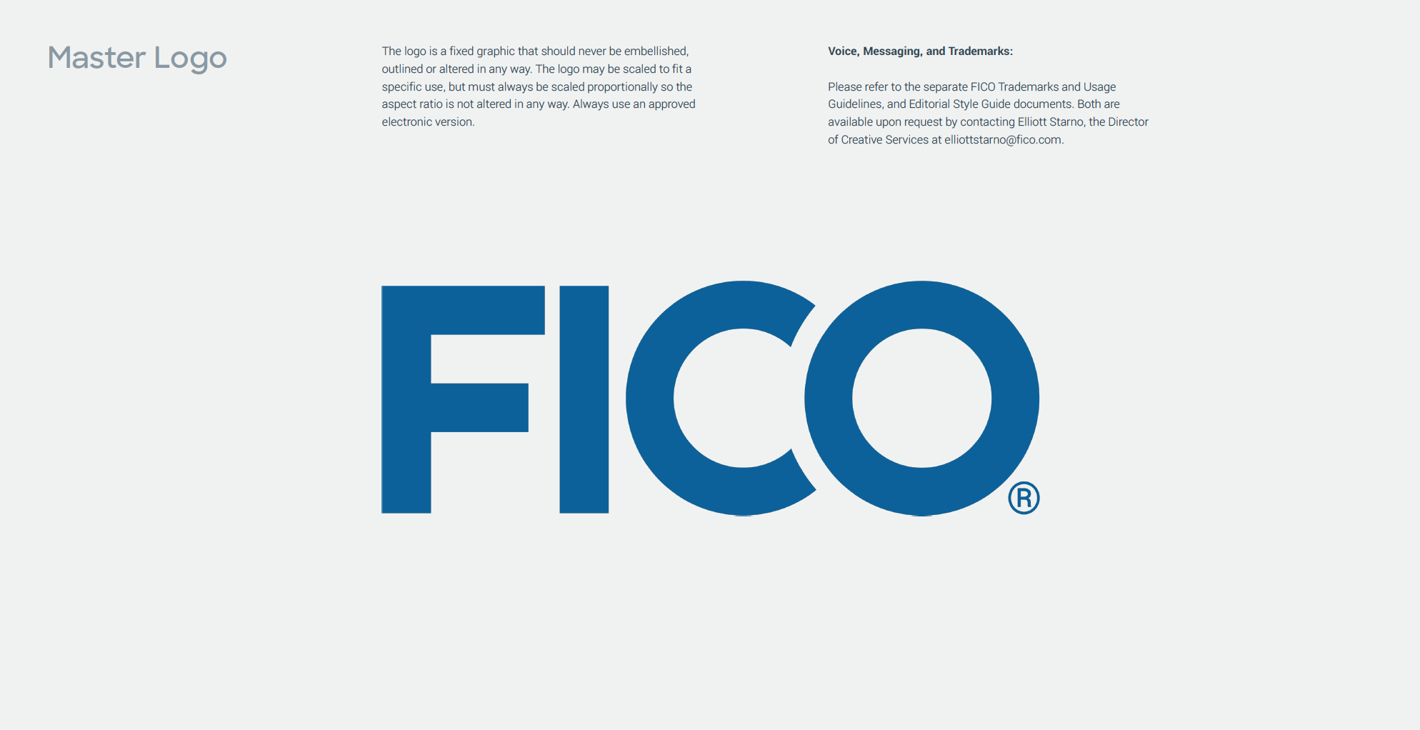
In the case of FICO, the registered trademark symbol is required to appear in every instance of their logomark on all marketing materials.

What to avoid
To preserve the memorability and legal protectability of a brand, there are strict limitations on the usage of logos. Logos are carefully rendered artwork and any alteration of the logo, apart from proportional scaling, is considered misuse.
In this example, the Oracle logo has been liberated from the red rectangle and its default usage is white text reversed out of a field of color. By reducing the number of separate elements and the amount of red, they hope to reduce visual noise and up-level the overall tone of the brand mark. They also removed the registration mark ® to further simplify visual presentation.
